
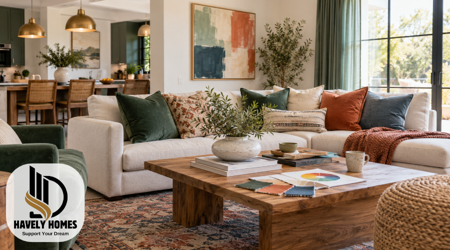
Color is one of the most important elements of interior design. It can make a room feel welcoming, fresh, cozy, or visually interesting. The right combination of colors also helps furniture, walls, flooring, and decorative accessories work together beautifully.
However, choosing colors for your home is not always easy. A shade that looks attractive in a photograph may appear completely different in your living room. Lighting, room size, existing furniture, and personal preferences all influence the final result.
Understanding how to use color in interior design can make decorating decisions much easier. You do not need professional training or expensive furniture to create a balanced home.
By learning basic color theory, choosing suitable combinations, and testing colors before making changes, you can create comfortable spaces that reflect your personal style.
Quick Answer:
To use color in interior design, start with your existing furniture and flooring, choose a balanced color palette, and consider lighting. Combine complementary shades, add accents, and test colors before making permanent changes.
Quick-Guide Table
| Possible problem | What to check | Recommended action |
| Room colors look mismatched | Furniture, flooring, and wall undertones | Choose colors that complement existing finishes. |
| Room feels too colorful | Number of strong accent colors | Use a calmer main color and fewer bold accents. |
| Paint looks different than expected | Natural and artificial lighting | Test physical samples at different times of day. |
| Room looks flat or dull | Texture, patterns, and contrast | Add textured fabrics, artwork, or contrasting accessories. |
| Colors feel disconnected between rooms | Repeated colors and shared finishes | Carry selected shades or materials into adjoining spaces. |
| Unsure which colors work together | Color wheel and existing furnishings | Begin with a simple two- or three-color palette. |
Helpful Steps: How to Choose the Right Colors for Your Home
- Look at existing features: Check your flooring, furniture, cabinets, and other finishes before selecting new colors.
- Choose your main color: Pick a shade that suits your room’s purpose, lighting, and personal taste.
- Add supporting colors: Use complementary or neighboring colors to create a coordinated appearance.
- Balance the palette: Use the 60–30–10 rule as a flexible starting point.
- Include texture and accents: Introduce color through rugs, curtains, cushions, and artwork.
- Test before decorating: Compare physical samples in natural and artificial light before making your final choice.
Understanding Color Theory in Interior Design
Color theory explains how different colors relate to one another and how they can be combined to create visual balance. It provides a useful starting point for decorating rooms without choosing colors randomly.
In traditional art-based color theory, colors are commonly divided into three groups:
- Primary colors: Red, yellow, and blue are the traditional primary colors used in basic painting color wheels.
- Secondary colors: Orange, green, and purple are created by combining traditional primary colors.
- Tertiary colors: These sit between primary and secondary colors, such as yellow-green and blue-green.
Colors can also be described as warm, cool, or neutral.
Warm colors, including red, orange, and yellow, are often associated with welcoming and lively interiors. Cool colors, such as blue and blue-green, can create a softer visual atmosphere.
Neutral colors include white, beige, gray, cream, and various earthy shades. They are especially useful because they provide a flexible background for furniture and accessories.
A few additional terms can help you understand paint and fabric samples. Hue means the basic color family, while a tint is a color mixed with white. A shade is mixed with black, and a tone is mixed with gray. Color intensity, also called saturation, describes how vivid or muted a color appears.
These basics help homeowners understand why certain combinations look balanced while others appear too busy.
How to Choose Colors Using the Color Wheel
A color wheel is a circular chart showing relationships between different colors. It is a useful tool for anyone learning interior decorating basics because it makes choosing combinations more straightforward.
You can use several common color schemes when planning a room.
Monochromatic color schemes use different lightness levels and variations of one color family. For example, a bedroom could feature pale blue walls, medium-blue bedding, and deep navy cushions. This approach creates variety while keeping the room visually connected.
Analogous color schemes combine neighboring colors on the wheel. Blue, blue-green, and green are a familiar example. These combinations often feel coordinated because the colors share similar characteristics.
Complementary color schemes use colors opposite each other on the wheel, such as blue and orange. They create stronger contrast. One color can dominate while the other appears in smaller accessories.
Triadic color schemes use three colors spaced evenly around the wheel. A traditional example is red, yellow, and blue. Using softer versions of these colors can make the combination easier to manage in a home.
The best color wheel for interior design is simply one that clearly shows these relationships. Beginners can use a printed wheel or a digital version without purchasing professional design equipment.
Remember that a color wheel suggests possible combinations. It does not guarantee that every shade will suit your furniture, lighting, or personal taste.
Build a Color Palette That Fits Your Room
A successful color palette should work with the features already present in your home.
Before choosing paint, examine your flooring, sofa, curtains, cabinets, rugs, and other large furnishings. These elements often have colors and undertones that influence your decorating options.
For example, a room with warm oak flooring and a cream sofa may look attractive with sage green walls and natural wood accessories.
Begin by choosing a main color that suits your preferences. Then select one or two supporting colors and an accent shade that adds contrast.
Some practical combinations include:
- Warm white, sage green, and natural wood for a soft, nature-inspired room.
- Cream, terracotta, and muted brown for a warm, earthy interior.
- Soft gray, navy, and white for a clean, contrasting scheme.
- Beige, dusty blue, and charcoal for a gentle but defined appearance.
An interior design colour palette generator can help you explore combinations before purchasing anything. These tools are useful for inspiration, although screen colors may differ from actual paint.
You can also create a simple inspiration board using fabric samples, paint chips, flooring photographs, and furniture colors.
For beginners, a basic color-theory book or illustrated guide can be helpful, but practical testing in your own home is more important than following a perfect-looking digital palette.
Using the 60–30–10 Color Rule for Better Balance
The 60–30–10 rule is a popular interior decorating guideline that suggests dividing a room’s visual color distribution into three parts.
Around 60% represents the dominant color, 30% supports it, and 10% introduces an accent.
The dominant color usually appears on larger surfaces, such as walls, major furniture, or large rugs. The secondary color creates variety through curtains, upholstery, or smaller furnishings. Accent colors appear in details such as cushions, artwork, throws, and decorative objects.
Imagine a living room with cream walls and a large cream rug. A sage green sofa and curtains provide the secondary color, while terracotta cushions and decorative ceramics introduce a contrasting accent.
The room now has a clear visual direction without requiring every object to match.
These percentages do not need to be measured exactly. Flooring, patterns, artwork, and furniture materials can make precise calculations impractical.
The main purpose of the rule is to create visual balance, not to restrict creativity. Some attractive rooms use two colors, while others successfully combine several.
Match Undertones and Neutrals Without Color Clashes
Two colors can appear similar on separate samples but look surprisingly different when placed together. Undertones are often responsible for this effect.
An undertone is a subtle color influence within another color. For example, white paint may lean toward yellow, pink, blue, or green.
Warm neutrals often contain yellow, orange, or red influences. Cool neutrals may contain blue, green, or violet influences.
When choosing wall colors, compare them with existing flooring and furniture. A warm beige sofa beside a cool gray wall might look attractive in one room but disconnected in another.
This does not mean warm and cool shades should never be combined. Mixing them can create attractive contrast when the overall palette feels intentional.
Natural wood, stone, metal finishes, and upholstery also influence how undertones appear.
Place physical paint samples directly beside these materials rather than judging colors from memory. Look at them together under the room’s usual lighting.
This simple comparison can prevent expensive decorating mistakes and help create a more coordinated interior.
How Lighting Changes the Way Colors Look
Lighting has a major influence on interior color. The same paint may appear warmer, cooler, lighter, or deeper depending on where and when you view it.
Natural daylight changes throughout the day. A north-facing room in the Northern Hemisphere often receives cooler, less direct daylight, while a south-facing room may receive stronger direct sunlight. Local climate, window size, and surrounding buildings also matter.
Artificial lighting creates additional differences. Warm-colored bulbs can make cream and beige shades appear warmer, while cooler lighting can change how blue and gray colors are perceived.
Lightness also affects the appearance of a room.
Pale colors generally reflect more light and may help create an airy impression. Darker colors reflect less light and can produce a dramatic, enclosed, or intimate look.
Paint manufacturers sometimes provide a Light Reflectance Value (LRV). This uses a scale from 0 to 100, with higher numbers indicating greater visible light reflection.
However, a high LRV does not automatically make every room look larger.
Before painting, observe large color samples in the morning, afternoon, and evening. Check them under your usual lamps and ceiling lights.
This helps you understand the color’s actual appearance instead of relying only on showroom lighting or online photographs.
Add Depth with Texture, Patterns, and Color Contrast
Color is not the only feature that creates an attractive interior. Texture and patterns influence how a color scheme feels and looks.
Texture refers to the surface qualities of materials. Smooth wood, soft velvet, woven linen, polished metal, and rough ceramics all reflect light differently.
For example, a beige living room can become much more interesting through a textured rug, linen curtains, wooden furniture, and knitted cushions.
Even though the colors remain similar, the materials add visual depth.
Contrast is equally useful. Combining light walls with darker furniture can help define the room. A deep green sofa against a warm white background, for example, becomes a noticeable feature.
Patterns can also introduce several colors at once.
A patterned rug may connect the wall color with cushions and artwork. Similarly, patterned curtains can introduce a secondary shade without requiring another painted surface.
When combining patterns, vary their scale and give the eye some quieter areas to rest.
The goal is not to fill every corner with different materials. A few carefully chosen textures can make a simple palette feel complete.
Practical Color Ideas for Different Rooms
Different rooms have different purposes, so the same color palette may not work equally well throughout your home.
The best approach is to consider how each space is used, its lighting, and the furniture already present.
Living Room
Living rooms often benefit from a balanced combination of comfortable neutrals and personal accents.
Warm white walls, a beige sofa, wooden furniture, and olive green cushions can create a welcoming setting. For stronger contrast, consider navy upholstery with cream walls and warm-toned accessories.
Bedroom
Bedrooms are personal spaces where comfort matters more than following decorating trends.
Muted blue, sage green, warm beige, and dusty pink are possible choices for a softer appearance. Darker shades can also work beautifully when paired with suitable bedding and lighting.
Choose colors you enjoy seeing every day rather than assuming one shade will automatically improve relaxation.
Kitchen
Kitchen colors should coordinate with cabinets, countertops, backsplashes, and flooring.
White cabinets can work with many wall colors, while wooden cabinets often pair attractively with warm neutrals or muted greens.
Remember that countertops and tiles may be expensive to replace, making them important starting points.
Bathroom
Bathrooms often contain several fixed finishes, including tiles, sinks, and metal fixtures.
Soft neutrals can create a simple background, while blue or green accents add visual interest. Consider the room’s artificial lighting before selecting paint.
Dining Room
Dining rooms can support both understated and dramatic palettes.
Warm earth tones may complement wooden dining furniture, while deep blue or charcoal walls can create stronger contrast.
Home Office
A home office benefits from a comfortable palette that does not make everyday tasks visually difficult.
Muted greens, soft blues, and warm neutrals are possible options. Ensure adequate contrast between furniture, working surfaces, and important objects.
Make Colors Flow Naturally from One Room to Another
A well-designed home does not require every room to have identical colors. However, some visual connections can make the overall interior feel more coordinated.
One practical approach is to choose a small collection of colors that appear throughout the house in different ways.
For example, sage green might appear on living room cushions, bedroom artwork, and kitchen accessories.
Consistent trim colors, flooring materials, or neutral backgrounds can also connect adjoining spaces.
In open-plan homes, consider how colors look together from different viewing positions. Two rooms may have separate functions but still share the same visual space.
You can give bedrooms or smaller rooms more individual character while maintaining a common undertone or recurring material.
Repeating selected colors helps create continuity, but there is no requirement to use every shade exactly three times.
Focus on natural connections rather than rigid decorating formulas.
Easy Ways to Introduce Color Without Repainting
Adding color does not always require painting walls or replacing expensive furniture.
Small decorative changes can make an existing room feel different while keeping its main features unchanged.
Cushions, throws, curtains, rugs, and bedding are useful starting points because they introduce noticeable color without permanent alterations.
Artwork provides another opportunity. A painting containing blue, orange, and cream may inspire matching cushions or a small decorative vase.
Plants can introduce natural green tones, while wooden objects and woven baskets add warmth.
For renters, freestanding accessories are often more practical than permanent wall treatments. Check rental agreements before making changes that affect the property.
If you are unsure about a bold color, introduce it through one or two inexpensive accessories first.
Seasonal changes can also refresh a room. Lightweight textiles and lighter accents may suit one season, while deeper colors and heavier textures may appeal during another.
These adjustments allow you to experiment without committing to a complete redesign.
Test and Finalize Your Interior Color Choices
Testing is one of the most useful steps when planning an interior color scheme.
A shade may look perfect on a website but appear different beside your actual furniture and flooring.
Start by narrowing your options to a small selection of colors. Compare their paint chips, then obtain physical samples whenever possible.
A simple testing process includes:
- Place samples near the flooring, furniture, and other finishes that will remain in the room.
- Test larger areas or movable sample boards, following the paint manufacturer’s directions.
- Observe each color in natural daylight and under the artificial lighting normally used.
- Compare your preferred wall color with curtains, rugs, fabrics, and decorative accessories.
- Review the complete palette before purchasing paint or large furniture.
Allow painted samples to dry properly before judging their final appearance. Paint finish can also affect how a color looks because matte and shinier surfaces reflect light differently.
For larger renovations, unusual room layouts, or complicated whole-house schemes, an experienced interior designer or color consultant may provide valuable guidance.
Professional help is optional for ordinary decorating decisions, but it can be useful when several expensive finishes need to work together.
Common Mistakes to Avoid When Using Color
Choosing colors becomes easier when you recognize a few common decorating mistakes.
One frequent problem is selecting paint based entirely on online photographs. Digital images depend on camera settings, editing, and screen displays, so they cannot show exactly how a shade will appear in your home.
Another mistake is ignoring existing furniture and flooring. Even an attractive wall color may feel disconnected when its undertones compete with permanent features.
Using several strong colors without a clear relationship can also make a room appear crowded. This does not mean bright colors are unsuitable. They simply need thoughtful placement and enough visual balance.
Some homeowners follow color psychology too strictly. Although people associate certain colors with particular feelings, personal experiences and preferences vary. No single color guarantees a particular mood.
Overlooking texture and contrast can make an otherwise coordinated room feel flat. Mixing materials and adjusting light and dark elements often improves the result.
Finally, avoid choosing every color according to short-lived trends.
A fashionable palette may look appealing in photographs, but your home should remain comfortable and enjoyable long after that trend changes.
Taking time to test colors and consider everyday needs is usually more valuable than rushing into a complete makeover.
Conclusion
Understanding how to use color in interior design helps you make more confident decorating decisions and create a home that feels connected and personal.
Begin with the colors and materials already present in your rooms. Use basic color theory to explore combinations, balance stronger shades with supporting colors, and consider how lighting affects the final appearance.
Texture, contrast, and carefully chosen accessories can improve a room without requiring expensive changes.
Most importantly, test your choices before committing to major purchases or painting projects. A beautiful, balanced home does not depend on strict design rules. It comes from choosing colors that work together, suit your surroundings, and reflect the way you want to live.
Frequently Asked Questions
What Colors Make A Small Room Look More Spacious?
Light colors such as soft white, pale beige, and light gray can help create an open appearance by reflecting more light. However, room layout, lighting, furniture, and contrast also influence how spacious a room feels.
Can I Use Dark Colors In A Small Room?
Yes, dark colors can work beautifully in small rooms. Deep green, navy, or charcoal can create a dramatic, comfortable atmosphere. Balanced lighting, thoughtful furniture placement, and contrasting accessories can help complete the design.
Should Every Room In My Home Have The Same Color Scheme?
No, every room does not need identical colors. You can give each space its own character while repeating selected shades, neutral finishes, or materials to create a natural connection throughout your home.
How Do I Choose Colors That Will Not Look Outdated Quickly?
Start with colors you genuinely enjoy and consider using versatile neutrals for expensive or permanent features. Introduce fashionable shades through smaller accessories that are easier and less expensive to change later.
Is A Color Palette Generator Useful For Beginners?
Yes, a color palette generator can help beginners explore matching and contrasting shades. However, digital colors may look different from physical materials, so compare actual samples with your lighting, furniture, and existing finishes.
Disclaimer: This article is provided by Havely Homes (havelyhomes.com) for general informational and educational purposes only. Color combinations, lighting conditions, and interior design preferences vary between homes. Readers should test materials and paint samples and follow manufacturers’ instructions before making decorating changes. Havely Homes provides this article solely to help visitors understand interior color design. It is not a paid promotion or advertisement.
