
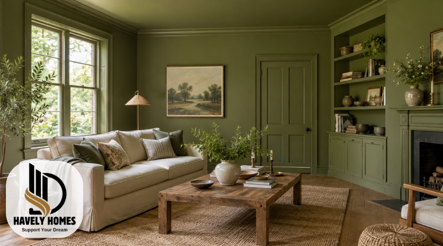
Color drenching brings a room together by carrying one paint color across its walls, ceiling, and woodwork. Instead of framing colored walls with white trim, you create a continuous background that lets furniture, textures, and architectural details take on a different role.
The result can be gentle and understated or rich and dramatic. A cream bedroom and a deep green dining room can both use this approach successfully, even though they look very different.
Choosing the right color is only part of the process. Lighting, paint finishes, surface preparation, and existing furnishings all influence the outcome. This guide explains how to make those decisions and adapt the technique to a home you enjoy living in.
Quick Answer:
Color drenching means using one paint color across walls, ceilings, and trim for a continuous look. Before starting, check how samples appear in your room’s lighting and choose suitable coatings for each surface.
Quick-Guide Table
| Possible problem | What to check | Recommended action |
| Color looks different at home | Samples beside flooring and furniture under daylight and lamps | Compare samples in several positions before choosing. |
| Room feels darker than expected | How the sample looks in shaded areas and evening light | Test a lighter alternative or reduce the extent of the drench. |
| Cream looks too yellow or pink | Its undertone beside existing white fittings and finishes | Compare alternative creams against those fixed features. |
| Painted trim may be difficult to clean | The coating’s intended surfaces and cleaning guidance | Choose a suitable product with the required durability. |
| Bathroom paint keeps peeling | Signs of condensation, leaks, or persistent damp | Resolve the moisture problem before repainting; seek assessment if it persists. |
| Unsure whether a radiator can be painted | Radiator guidance and paint suitability | Confirm compatibility before painting; leave controls and working components uncoated. |
Helpful Steps Before You Paint
- Choose the surfaces: Decide whether to include the ceiling, doors, trim, and built-ins.
- Review existing materials: Compare potential colors with flooring, upholstery, tiles, and worktops.
- Test a shortlist: Observe generous samples in different positions during daylight and evening lighting.
- Check paint suitability: Read the manufacturer’s guidance for each surface, primer, and finish.
- Inspect the room: Look for peeling paint, damage, or moisture without disturbing suspect old coatings.
- Plan the work: Calculate quantities using product coverage guidance and arrange safe access or professional help.
What Is Color Drenching?
In its fullest form, color drenching uses the same paint color on walls, ceilings, and woodwork, including baseboards, door frames, and window trim. Doors and built-in storage can join the scheme. Some homeowners also include radiators, provided the coating is suitable for that particular surface and its operating conditions.
It does not mean painting every object. Floors, sofas, curtains, and decorative pieces can remain different colors. Their contrast often helps the room feel balanced.
An accent wall concentrates color on one surface. Matching walls and trim creates more continuity, but a contrasting ceiling still gives the room a clear upper boundary. A full drench extends the color overhead.
You can adapt the idea rather than follow it rigidly. Leaving natural wood exposed or keeping a lighter ceiling changes the effect, but may suit your home better.
How Color Drenching Changes the Feel of a Room
Contrasting trim draws attention to doorways, corners, and the edges of walls. When these elements share a color, their outlines become less prominent. The eye moves across the space with fewer interruptions.
This can make a room feel more unified. Pale colors may produce a gentle background, while deeper shades can create an enclosed, intimate atmosphere. These are visual impressions rather than guaranteed emotional effects.
Claims that color drenching always makes rooms look larger need caution. Reduced contrast may soften boundaries, but a dark ceiling can also feel more enclosing. Daylight, furniture size, ceiling height, and the chosen color all matter.
There is also more work involved than repainting walls alone. Doors, trim, and ceilings add preparation and application time. Consider whether the finished appearance justifies that extra commitment.
Is Color Drenching Right for Your Space?
Start with how you use the room. A space mainly enjoyed in the evening may suit a different palette from a kitchen where you want a bright daytime setting.
Look at the room’s proportions and lighting. Small rooms are not automatically unsuitable for deep colors, and large rooms do not require pale ones. Decide whether you want openness, a stronger sense of enclosure, or something between the two.
Next, assess the architecture. Matching trim can make several doorways less visually busy. However, if you love detailed woodwork or an original timber door, contrast may help you appreciate it.
Consider views into adjoining rooms, too. The color should work with the flooring and furnishings visible through open doors.
If you are uncertain, try the approach in a smaller room first. Renters should check their agreement and obtain any necessary permission before painting ceilings, doors, or fitted elements.
How to Choose a Color and Test It Properly
Begin with materials you expect to keep. Flooring, stone, upholstery, and large rugs provide a more useful starting point than a photograph of someone else’s home.
Light neutrals offer a quieter color statement. Muted midtones add noticeable color without necessarily dominating the room. Deeper shades create a stronger background, particularly when extended onto the ceiling.
Pay attention to undertones: the subtle color influence within a shade. A beige might lean pink or yellow, while a gray may appear blue or green. These differences become clearer beside other materials.
Shortlist a few options and test generous samples according to the sample manufacturer’s instructions. Movable sample boards can help you compare the same shade beside furniture, near trim, and in darker corners.
Observe them from morning to evening, with your usual lamps switched on. Check the intended finish as well, since a color sample may not show the sheen of the final coating.
Use screens and photographs for inspiration, then make the decision in the room itself.
Color Drenching Paint: Choosing Products and Finishes
A paint color and a paint product are separate choices. You may need several coatings tinted to the same color because plaster walls, wooden doors, cabinets, and metal have different requirements.
Check which surfaces each product supports. A wall coating should not be assumed suitable for furniture, radiators, or kitchen cabinets. Preparation and primer requirements can also differ between bare material and previously painted surfaces.
Sheen describes how shiny the dried paint looks. Flat and matte finishes reflect less light, while satin and gloss finishes create more visible reflection. This can change how the same color appears across the room.
Matching sheens can give a continuous appearance where a suitable multi-surface product allows it. Alternatively, a lower sheen on walls and a higher sheen on trim can introduce subtle contrast.
Neither approach is compulsory. Choose for appearance, cleaning needs, and product performance. Read the technical guidance rather than assuming every matte paint is delicate or every shiny paint is appropriate for a particular room.
Color Drenching Ideas: From Cream to Richer Shades
Cream color drenching offers a way to explore the technique without using a strong hue. Carrying cream across walls, trim, and ceiling can create a soft background for timber furniture, woven fabrics, and textured upholstery.
Creams vary considerably. Some look buttery; others lean toward beige or peach. Compare them with white kitchen fittings, stone surfaces, and existing flooring so the undertone feels intentional.
Muted greens can work alongside natural wood and patterned fabrics. Dusty blues offer another option for rooms with warm timber or leather. Earthy pinks, clay shades, and browns can provide a richer backdrop, while navy or deep green creates a more pronounced color statement.
These are starting points, not universal combinations.
Single-color drenching uses one shade. Tonal layering introduces lighter and darker versions of a color. Double drenching, as described by Little Greene, combines different hues rather than simply varying the strength of one shade.
Choose the approach that produces the amount of contrast you want.
Color Drenching Bedroom Ideas
A bedroom is a useful place to coordinate walls, ceilings, doors, and trim because the bedding can provide an easy change of texture or contrast.
For a light scheme, consider a warm neutral with a fabric headboard and bedding that differs slightly in tone. A muted blue or green can work with patterned curtains or a timber bed. Deeper shades provide a stronger background for pale linen, artwork, and lighter furniture.
The bed does not need to match the walls. Decide whether it should blend into the room or become its main focal point.
Check samples under bedside lighting, particularly if you use the bedroom mainly after dark. A shade you like beside a sunny window may look quite different near a reading lamp.
Choose a palette you find comfortable, but avoid expecting a particular paint color to improve sleep. Bedding, lighting, noise, and room temperature also shape the experience.
Color Drenching Bathroom Ideas
Bathrooms usually contain substantial areas that remain unpainted, such as tiles, basins, baths, and shower screens. Build the palette around these fixed features rather than trying to disguise them.
Repeating a color across suitable walls, the ceiling, and trim can still create a cohesive scheme. Coordinate it with tile undertones and metal finishes, and treat painting a vanity as a separate coating decision.
Choose products approved for the relevant surfaces and bathroom conditions. A bathroom does not automatically require a glossy finish; some matte products are designed for high humidity. Suitability depends on the formulation.
Humidity resistance is also different from suitability for direct water exposure. Ordinary wall paint should not be assumed appropriate inside a shower or on tiles.
Resolve leaks, persistent condensation, or damp before decorating. Paint cannot correct their causes. Where ventilation is inadequate or moisture damage keeps returning, get the problem assessed before covering it with a new finish.
Ideas for Living Rooms, Kitchens, and Hallways
In a living room, a continuous painted background can bring several elements together. A textured rug, wooden coffee table, and artwork give the eye distinct details to notice. Choose whether the sofa should sit quietly within the palette or stand out.
Kitchens require more careful product planning. Walls, cabinet doors, and trim can share a color, but may need different coatings. Existing worktops, splashbacks, appliances, and flooring should guide the choice. There is no need to paint attractive timber simply to complete the scheme.
Hallways often have several doors and limited daylight. Matching doors and frames can reduce their visual prominence, while a suitable washable finish helps with everyday marks.
In open layouts, repeating a color can connect areas. A more concentrated application in an entryway, reading corner, or pantry can distinguish that space. Consider where the color will stop so the transition looks deliberate.
Planning and Preparing Your Painting Project
Write down which surfaces you intend to paint before buying supplies. Include ceilings, trim, doors, and fitted storage rather than estimating from wall area alone.
Use the coverage information for each selected product to calculate quantities, allowing for the recommended coats. Rough or absorbent surfaces may affect coverage, so consult the manufacturer’s guidance.
Budget for preparation materials, primers, brushes, rollers, protective coverings, and safe access equipment. Extra surfaces can increase both cost and working time.
Before starting:
- Check for peeling coatings, damaged surfaces, and moisture problems.
- Confirm suitable preparation and primer requirements for each material.
- Follow instructions for application, ventilation, drying, and recoating.
- Arrange safe access to ceilings and high areas.
Do not sand or scrape suspected lead paint without qualified advice. In the United States, homes built before 1978 need particular attention; elsewhere, follow local guidance.
Avoid removing or altering electrical fixtures yourself. Use a qualified professional when access requires electrical work, or when high areas cannot be reached safely.
Styling the Room and Comparing Before-and-After Results
A repeated background color leaves plenty of room for variety. Timber grain, woven upholstery, metal, ceramics, and artwork can provide detail without introducing many additional colors.
Use different shapes as well as textures. A rounded chair beside a straight-edged cabinet, for example, adds interest even when both fit within a restrained palette.
Choose what should blend in and what should stand out. Matching built-in shelves can make them less prominent, while a contrasting armchair becomes easier to notice.
When browsing images of color drenching, study the decisions behind the result: which surfaces were painted, where natural materials remain, and how lighting is arranged.
For your own before-and-after comparison, use a similar camera position and lighting. Otherwise, changes in exposure can exaggerate the transformation.
Photographs help explain a design idea, but editing, screens, and camera settings prevent them from reliably predicting how paint will look in your home.
Common Mistakes and When to Get Professional Help
One common mistake is selecting a color without checking it beside existing materials. Another is choosing the right shade in a coating that cannot meet the surface’s needs. Both can lead to disappointment after considerable work.
Using one finish throughout is not automatically wrong. It can suit the design when the product is approved for all intended surfaces. Likewise, keeping a contrasting ceiling is a choice, although it changes the continuous effect of a full drench.
Radiators and specialist surfaces deserve separate checks. Confirm coating suitability and preparation requirements with the relevant manufacturer. Do not coat valves, controls, or working components simply because they interrupt the palette.
Get professional assessment for persistent damp, suspected hazardous coatings, or extensive damage. A decorator can help with complex preparation, difficult access, and application. A color consultant may be useful when several adjoining rooms or expensive fixed finishes make the palette difficult to resolve.
Conclusion
Color drenching works best when the color, materials, and painting plan support one another. The aim is to create a room you enjoy, whether that means soft cream across its main surfaces or a deeper shade surrounding contrasting furniture.
Begin with the finishes you are keeping, shortlist a few colors, and test them under the light you actually use. Then choose suitable coatings and decide which surfaces belong in the scheme.
Careful preparation matters as much as the palette. With those decisions settled, you can approach the project with a clear idea of the appearance, work, and materials involved.
FAQs
Does Every Piece Of Furniture Need To Match?
No. Color drenching mainly concerns the painted background. Furniture, flooring, artwork, and textiles can introduce contrast. Keeping some natural materials visible helps you create variety without abandoning the overall scheme.
How Is Color Drenching Different From An Accent Wall?
An accent wall places a contrasting color on one wall. Color drenching extends a color across several architectural surfaces, usually including walls, trim, and the ceiling, to create greater visual continuity.
Is Double Drenching Simply Using Lighter And Darker Shades?
Not exactly. Little Greene describes double drenching as combining different hues, rather than only changing one color’s strength. Using lighter and darker versions of the same shade is better described as tonal layering.
Can Color Drenching Work In A Rented Home?
It can, provided your rental agreement allows the changes and you obtain any required permission. Confirm whether ceilings, doors, and fitted elements may be painted, and whether you must restore their previous finish.
Will Color Drenching Make A Room Look Bigger?
It may soften visual boundaries by reducing contrast, but a larger-looking room is not guaranteed. The result depends on the color, ceiling height, lighting, furnishings, and proportions of the space.
Disclaimer: This article provides general decorating information. Paint products, surfaces, and preparation requirements vary, so follow the relevant manufacturer’s instructions and seek qualified advice for suspected lead paint, persistent damp, or difficult access. Thermostat troubleshooting also varies by model; consult its manual or official support. Electrical, wiring, gas, furnace, and complex HVAC work require a qualified professional. Havelyhomes.com is not an official Honeywell support service and claims no affiliation.
